Yep. Here it is:
 Here's the thing about this version of the Portland flag; it follows all the "rules" of vexillology.
 It's simple - just two lines or bars crossing with a diamond in the juncture on a green field. The pattern of the crossing bars mimics the junction of the Willamette and Columbia Rivers that dominate the Portland region. It uses no more than about three or four colors, doesn't use "lettering or seals", which the flag gurus consider too busy and fussy, and while it is distinctive it's bars and stripes are similar to the stripes of the American flag.
So by the ideals of people who "do" flags, the present Portland flag is just about perfect.
But...I don't like it as much as I liked the older version:
 Don't ask me why. I just like the '69 version better than the '08 version.
Yes, I know that it has the fussy little City of Portland seal in the canton, a big vexil-no-no. There's just something about that little bit of fiddly archaeism that pleases me. I LIKE that it has the Portland seal complete with Portlandia commanding her teeny little ships and plows.
But, then, I'm the sort of person who likes the old-school Prussian regimental flags
 BECAUSE of all the fiddly little details - the crowned eagle, the scrolls with the battle honors, the various rays and flames and royal cyphers all over. I like fiddly details of that sort. They satisfy me immensely.
I like the fact that our Oregon flag has different images on different sides, and, yes, I like the fact that we have lettering AND our seal on the obverse:
 and our mighty Beaver on the reverse:
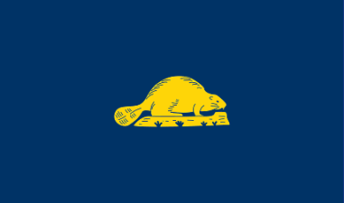 (and we're the ONLY state that does this, perverse creatures that we are...) And I take an equally perverse pride that the vexillologists consider ours something like the 3rd worst state flag in the U.S. I have no idea who rates below us; probably somebody like American Samoa or Guam. I like the fact that the professional flag-wavers hate us for our dorky, fussy, un-vexillogical untidiness.
Not long ago the World's Worst Newspaper ran a contest to design a replacement for our vexillologist's-most-hated flag, and here it is:
 Does that or does that not look like the sort of thing that would win a newspaper design contest? All simple primary colors with the simple cartoon beaver minus his beloved log, and even a little star because...well, I have no idea because why. Because...stars are special or a reference to the Star-spangled Banner? Who knows? To me it looks perfectly idiotic.
Call me a curmudgeon, then; I like the little fussy touches on my city and state flags; in the archaic and unprofessional symbols you can see the people who came before us and their love of busy detail - living reminders that flags that stand for real people and real places are as imperfect as the people who create them both.
4 comments:
I'm with you -- I like heraldry, and it gives a sense of history and evolution.
The block-y colors are so ... juvenile. They enforce a sort of blah equivalence, which is not the truth in matters either state or personal.
Juvenile - that's exactly it, Lisa.
I like the fiddly, un-vexil-approved banners BECAUSE they're so complex and fiddly, just like adulthood. Simple designs and bold colors are childhood; fun and happy, but lacking the darkness and complexity that distinguishes adulthood.
As always, you pare through my verbiage to lay the essential truth bare. Gratia, domina.
Oh, and I love the new icon. Very strikingly beautiful, and (although any vexillologist would remind us) though beauty is not essential, it is always a delightful reward.
You're very kind, m'dear, and make my night happier :)
[A friend caught me in my peasant look.]
Post a Comment